Indian Motorcycle traded distinctiveness for familiarity
By Kevin Weitzel
When Indian Motorcycle was relaunched in 2011 under the stewardship of Polaris Inc., the opportunity seemed enormous. The heavyweight American cruiser market had long been dominated by Harley-Davidson, a company whose visual language, teardrop tanks, blacked-out V-twins, and low-slung silhouettes had become synonymous with the category itself. For Polaris, reviving Indian wasn’t simply about selling motorcycles. It was about reintroducing one of America’s oldest motorcycle marques and offering something visually and culturally different.
At lunch, it felt like they might do exactly that.
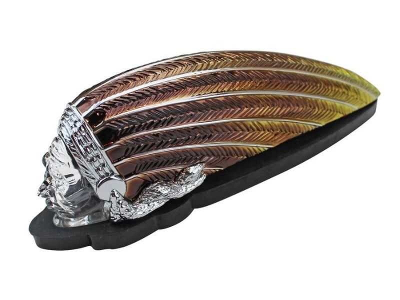
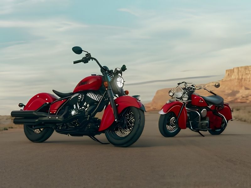
Early modern-era models such as the Indian Chief Classic and Indian Chieftain leaned heavily into design elements that made the brand historically recognizable: valanced fenders, prominent war-bonnet styling, deeply skirted bodywork, and flowing lines that looked almost art deco compared to the industrial minimalism common in Harley’s lineup. They were unmistakably Indian. Even at a distance, the bikes carried a silhouette that separated them from Milwaukee’s machines.
For a moment, the strategy seemed clear. Don’t “me too” Harley. Be Indian.
This approach also served a practical purpose. The cruiser and touring market is famously brand-loyal and competing head-on with Harley-Davidson using similar aesthetics is difficult. A distinct design language allowed Indian to appeal to riders who wanted something American but different, as well as those drawn to the brand’s heritage without wanting a visual clone of the dominant player.
But over the next decade, something shifted.
As Indian expanded its lineup, with models like the Indian Scout Bobber, Indian Challenger, and various stripped-down cruiser variants, the design philosophy began to drift. Valanced fenders disappeared from many models. Bodywork became simpler and darker. Blacked-out engines and minimalist styling cues, long associated with Harley’s modern strategy, became common across Indian’s catalog.
Individually, none of these changes were shocking. Motorcycle design trends are evolving, and manufacturers respond to market demand. Collectively, though, they represented a gradual visual convergence with the company Indian once had the chance to stand apart from.
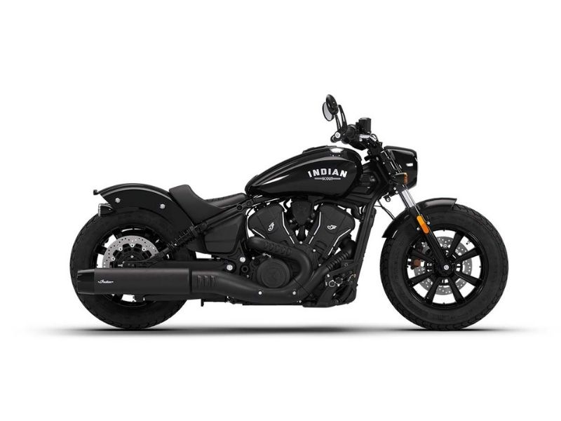
By the early 2020s, many Indian models, particularly in the midweight cruiser segment, began occupying the same aesthetic territory long defined by Harley’s Harley-Davidson Softail and Harley-Davidson Sportster families: muscular tanks, short fenders, black finishes, and stripped-down silhouettes. The design signatures that once separated Indian from its rival became less consistent across the lineup.
The result is not that Indian motorcycles became bad motorcycles. Far from it. By most technical measures, engines, reliability, and build quality, the modern lineup is strong and competitive. The question is more philosophical than mechanical.
When Indian returned, it carried over a century of history and a visual identity unlike anything else in motorcycling. That heritage gave Polaris a rare opportunity to build a modern American motorcycle brand that did not simply mirror the market leader.
Fifteen years after the relaunch, Indian remains successful, respected, and widely recognized. But the brand that once looked unmistakably different now often blends into the visual language defined by its biggest competitor.
The vision was distinctive.
The launch was bold.
The shift was gradual.
The result, some might argue, is a little more vanilla.
A brand’s visual identity is its most valuable asset until it starts to fade. Don’t let your community’s vision blend into the background. Let Outhouse help you define a look that remains unmistakable.