• Skip to primary navigation
  • Skip to main content
Outhouse logo

Outhouse

The Outsource Hub for Home Builders

  • Home
  • Products & Services
    • Architectural/CAD
    • Rendering
    • Virtual Reality
    • Interactive Floor Plans
    • Interactive Site Maps
    • Interactive Kiosks
    • Print Marketing
    • Sales Office Displays
  • Partners
  • News
    • Events
    • Blog
    • Podcast
  • About Us
  • Contact Us
  • Show Search
Hide Search

OutPerform

Builder Marketing Summit 2026 Takeaways

Tabitha Warren · 10/12/2026 · 1 Comment

Builder Marketing Summit: 3 Topics I Can’t Stop Thinking About 

Kevin Weitzel from Outhouse Speaking to three other guest speakers on stage.

The best conference sessions don’t just hand you ideas; they hand you permission to use them. That’s what three speakers did for me in Dallas this September, and I’ve been carrying their slides around in my head ever since.

Barrett Davis showed us how to stop doing the work alone. Kimberly Mackey reminded us who we are while we lead. Cory Charles sent us home with our thumbs over the send button. Taken together, they form a surprisingly complete playbook: build the system, protect the person running it, and ship the idea before Monday swallows it.

If you’re a builder marketer wearing a thousand hats (and I’ve yet to meet one who isn’t), these are the takeaways worth stealing.

Barrett Davis: The “A” in AI Is Really Agency
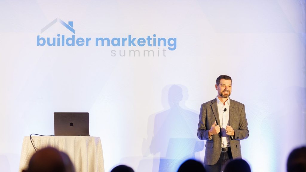
Barrett Davis speaking onstage to guests at the Builder Marketing Summit.

Barrett Davis (CEO at NterNow and a 40 Under 40 Builder honoree) opened with a line that got a knowing laugh: AI stands for Artificial for a reason in home building. Then he flipped it. The “A” that actually matters is agency. His advice was blunt and freeing: “Just do stuff; and do it quick.”

He named the three excuses that stop everyone, and I felt seen by every one of them:

  1. Your data is garbage. It will never be clean. Start anyway.
  2. You don’t have time. You won’t find time; you take it. Thirty minutes, today.
  3. There’s always a shiny new thing. New model, new tool, new hype. Ignore it and ship.

The heart of his talk was a mindset shift for marketers who carry the whole department on their backs: stop doing the work alone and build a system that does it with you. He described three kinds of support to build around yourself: a Coach that keeps you accountable to weekly progress, a Critic (his words: “the a-hole friend”) that gives brutally honest feedback on your campaigns and copy, and your Peers, because, as he put it, no one knows what they’re doing. Make the group chat. Share the wins.

He walked us through a leveled path, from connecting your CRM, documents, calendar and email, to building repeatable skills, a brand system saved as a file, and scheduled agents, all the way to a weekly improvement loop. His suggested first task was so practical it made me grin: have AI go check every community page on your site and list what’s out of date. (Every builder marketer reading this just winced a little. Me too.)

And then came the coolest giveaway I have ever seen come through the Summit. Barrett built a Claude tool exclusively for Summit attendees that each person could personalize to their own company’s website. Not a swag bag; a working system you could take home and use Monday morning. That is agency in action.

The line I wrote down twice: “You stop being the person who maintains the system. You become the person who decides what it should do next.”

Kimberly Mackey: Lead Without Losing Yourself

Kimberly Mackey speaking onstage to guests at the Builder Marketing Summit.

If Barrett’s talk was about building systems, Kimberly Mackey’s was about protecting the human at the center of them. “Lead Without Losing Yourself” was incredibly empowering, and it’s a message I think every one of us needs right now, as the world keeps speeding up and the pressure to keep pace never lets go.

Kimberly grounded her talk in a piece of timeless wisdom attributed to Robert Woodruff, the longtime leader of Coca-Cola:

  • The five most important words: “I am proud of you.”
  • The four most important words: “What is your opinion?”
  • The three most important words: “If you please.”
  • The two most important words: “Thank you.”
  • The least important word: “I.”

Read that list slowly. Not one of those phrases costs a dime, and every one of them is easy to skip on a hectic Tuesday. As a business owner, I know how quickly leadership can shrink into a to-do list; you start managing tasks and forget you’re leading people. Kimberly’s reminder was that the words we choose with our teams are the leadership.

She paired that heart with accountability through her 10-5-2-1 approach and a simple truth about scorecards: numbers don’t lie. The 10-5-2-1 formula is a weekly sales productivity rhythm that makes consistent results predictable:

  • 10: Engage 10 new prospects every week.
  • 5: Secure 5 first appointments from those prospects.
  • 2: Hold 2 follow-up (or “be-back”) appointments.
  • 1: Close at least 1 sale.

Keep that pace all year (with a well-earned two-week vacation) and you land at 50 sales. What I love most is where it puts your focus: on the daily and weekly habits you can control, rather than the outcomes you can’t. (And if your leads are highly qualified, you may need fewer first touches to hit the same number.)

Kindness and clarity are not opposites. The best leaders hold both: they say thank you, and they keep score.

That balance is exactly how you lead without losing yourself. You don’t have to become colder to become more effective.

Cory Charles: Send It
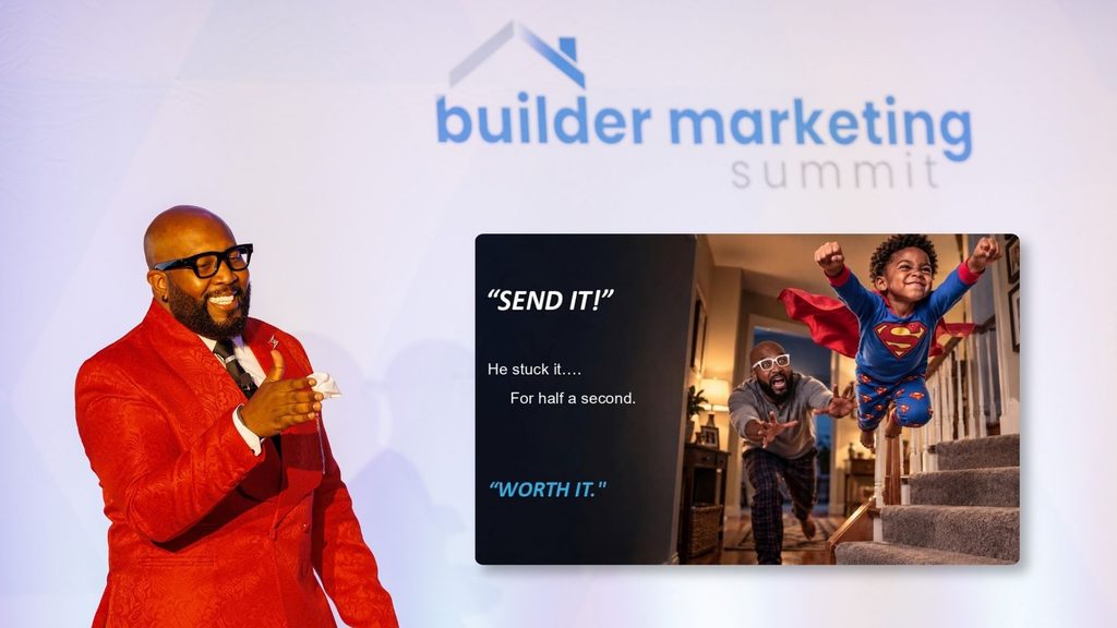
Cory Charles Speaking at the Builder Marketing Summit With a motivational meme.

Cory Charles closed the Summit with the perfect motivating send-off. He started with a story about a kid (him) at the top of Coffin Hill with a used Huffy, a prayer, and four seconds of conviction. No plan. No trusted brakes. One decision: send it.

Then he pointed at something every marketer in the room has: the drafts folder. He called it “the best-organized graveyard in America,” full of campaigns, scripts, and conference notes waiting for one more revision. What happens to everything you learned at a conference? Usually, nothing. Not because we lack skill, but because we’re waiting for permission.

His S.E.N.D. IT framework is simple enough to tape to your monitor:

  • Sort: pick one idea for this week. Forty options kill action.
  • Erase the excuse: your excuse isn’t a fact; it’s a draft, and drafts get edited.
  • Name the date: an idea with no date is just a nicer-sounding excuse.
  • Deploy: imperfect, public, shipped. A live campaign beats a perfect one stuck in review.

The moment that stuck with me most was the simplest. Cory had us say our one thing out loud to the person next to us, then pull up a text or email with our thumb hovering over send. He reminded us that we don’t have to do this alone: we can ask people to be our accountability buddies as we put our ideas into action. Saying it to another person turns a nice idea into a promise.

His closing line is the one I’ll be quoting all year: “Good ideas don’t build homes. Sent ones do.”

Put It Into Action (and Save Your Seat for 2027)

Here’s what strikes me about these three talks side by side: they’re really one lesson told three ways. Build a system so you’re not doing it alone. Lead your people with words that cost nothing and mean everything. Then pick one idea, give it a date, and send it.

So in the spirit of Cory’s challenge, here’s mine. Choose one takeaway from this post. Tell a teammate (your new accountability buddy) what you’re going to do and when. Then do it before Monday moves you.

And if these sessions sound like the kind of room you want to be in, I’d love to see you at the next Builder Marketing Summit in 2027. It’s built for the people who market, sell, and lead in home building, and it’s the one event every year where I come home with a full notebook and a lighter heart. Keep an eye on buildermarketingsummit.com for dates and registration. 

The Outhouse team will be there, notebooks open and ready to send it. Come find us and tell us what you shipped.
Chat with us

Common CAD Mistakes That Slow Down New Home Sales

Bill Gelbaugh · 09/28/2026 · Leave a Comment

What Craig’s Post Already Solved, and What It Didn’t

3d Rendering of house

Craig in our last post on CAD made the case for standardizing your construction documents across every architect you hire. One CAD standard, however many designers. Get that policy right, he argued, and a lot of the friction downstream (field errors, slow permit reviews, marketing production that starts from scratch on every new plan) goes away, because everyone’s finally working from the same standardized file.

He’s right. However, I’m here to talk about what’s still true even after you’ve done everything Craig recommended.

A single, well-standardized file can still carry mistakes. A layer that’s named wrong even though it’s in the right format. A material that was never called out even though this is exactly what your standard requires. A dimension that’s close enough to pass a permit reviewer but not clean enough to survive being handed to someone three departments away who has to interpret what the drafter meant instead of just reading what they drew. Standardization fixes the format mistakes live in. It doesn’t stop them from happening in the first place. And that’s exactly how a small one can grow into an expensive one.

What Every Builder Already Knows

Ask a builder where CAD mistakes cost them money and you’ll get an honest answer: permitting delays, a contractor framing off the wrong revision, a change order nobody wanted. That answer isn’t wrong. It’s just the first chapter, and it’s the chapter everyone already reads, because it’s the one that shows up loudly, on a schedule, in a meeting where someone has to explain the delay out loud.

The Chapter Nobody’s Counting

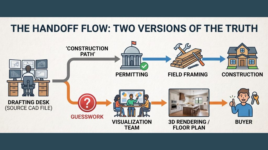
Here’s the part I’ve watched happen for thirty years and almost never heard anyone call a CAD problem. The same incorrect layer naming, the same missing material callouts, the same inconsistent dimensioning that causes a permitting headache also lands on someone else’s desk entirely: the person trying to turn that file into a rendering, or a marketing floor plan, or the visual a buyer is going to fall in love with before the home even has a foundation.

That person doesn’t get to send it back and ask for a redraft. They’re usually working against a launch date. So they guess and do the best they can. They fill in a material that wasn’t specified. They square off a dimension that wasn’t clean. They build something that looks finished and feels confident, and it goes out to buyers looking polished and professional. Nobody upstream ever hears about it, because nothing broke. The visualization team just quietly absorbed a problem that started as a CAD mistake and became their problem to solve under deadline, with an on-the-fly fix standing in for accuracy.

That’s the cost nobody’s counting. It doesn’t show up as a change order. It shows up as time the visualization team spent guessing and reworking instead of building, and a marketing floor plan that’s now carrying an assumption nobody flagged as an assumption.

Where It Gets Expensive

Here’s where I’ve watched it turn from an invisible cost into a real problem, and it’s the part of this story that actually matters. If that same original mistake also slips past permitting (and sometimes it does, because permitting and marketing are checking for different things), you don’t end up with one version of the house moving forward. You end up with two.

The buyer has seen a rendering, or a marketing floor plan, built from a file that had a guess baked into it. The field crew is building from the construction documents, which may have been corrected since marketing pulled their source, or may be carrying the same original mistake in a slightly different form. Nobody planned for two versions of the truth to exist. They just quietly do, because the file that fed marketing and the file that fed the field stopped being the same file the moment someone downstream had to interpret a gap the original CAD work left open.

The buyer doesn’t find out in a meeting. They find out standing in a framed house, pointing at a window that isn’t where the rendering showed it, or asking why the kitchen island doesn’t match what they picked from a floor plan that had already been revised twice by the time it reached the site. It’s the same original CAD gap, showing up twice, to two different people, neither of whom has any reason to trace it back to where it actually started.

What This Actually Costs

Couple in unbuild house holding tablet with a living room model.

I don’t think the number matters as much as the shape of it. A gap in a CAD file costs almost nothing to close at the drafting desk. It costs someone real time when it surfaces as a guess the visualization team has to make under deadline. And it costs something much harder to price, mostly buyer trust, but also builder credibility and an afternoon nobody wanted to spend, when it surfaces a third time as a mismatch between what was promised and what’s being framed. Same mistake. Three different price tags, and only the first one is cheap.

What Will You Choose?

You can keep treating CAD accuracy as something that matters up until the permit clears, and hope everything downstream sorts itself out. Or you can start asking, at the point the file leaves the drafting desk, whether it’s clean enough to do the two other jobs waiting for it: becoming the marketing your buyer falls in love with, and staying true to the home your crew actually builds.

Outhouse has spent thirty years standing exactly at that handoff, watching which builders ask that question early and which ones find out the hard way. What will you choose?

Need help with your CAD decisions contact Outhouse.

Contact Outhouse.

Interactive Geospatial Site Maps: A Smarter Way for Homebuilders to Showcase Their Communities

Tabitha Warren · 09/27/2026 ·

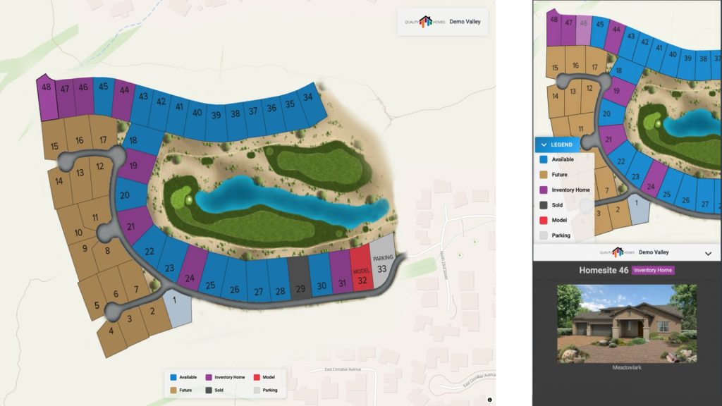
Interactive Geospatial site map

If you’re a homebuilder, you already know how important your site map is.

It’s often the first place buyers go to understand a community: which lots are available, where homes sit, what’s nearby, and how everything fits together. But many site maps today stop short of truly helping buyers (and sales teams) make confident decisions.

That’s exactly the gap Interactive Geospatial Site Maps are designed to fill.

This isn’t about flashy technology for its own sake. It’s about giving you a clearer, more intuitive way to present your communities, one that works just as well for your buyers online as it does for your sales team in the field.

A Familiar Upgrade, Not a Disruption

One of the biggest concerns builders have when adopting new tools is disruption: retraining teams, changing workflows, or reworking existing websites.

Geospatial Site Maps were built to avoid that entirely.

If you’re already using a traditional Outhouse interactive site map, this is a seamless upgrade, not a replacement that forces you to start over.

What that means for you:

  • The same proven production process behind legacy site maps
  • A familiar interface your team can use immediately
  • No retraining required for sales or marketing teams
  • A smooth transition that feels like a natural evolution, not a risky leap

You get more capability without introducing friction.

Designed Around How Buyers Actually Shop

Most buyers don’t think in terms of data layers or coordinates. They think in terms of location, views, proximity, and livability.

That’s why design matters so much.

Interactive Geospatial Site Maps use elevation imagery and comprehensive site data to give buyers a more realistic sense of place. Instead of feeling like a bolt-on to your website, the map becomes part of the experience.

Key design advantages include:

  • Wall-to-wall layouts with no headers, footers, or fixed navigation
  • A clean, immersive presentation that feels native to your site
  • Clear lot-level detail without visual clutter

On mobile, where many buyers start their search, this difference is especially noticeable. A thoughtfully designed map builds confidence. A clunky one creates hesitation.

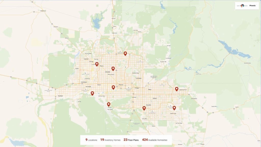
Map Showing Geographic Locations within the Interactive Geospatial Sire Map

Immediate Value for Sales and Marketing Teams

For sales teams, better maps mean fewer explanations and clearer conversations.
Buyers can quickly understand:

  • Where a lot sits within the community
  • How elevation and surroundings impact the homesite
  • What’s nearby and why location matters

For marketing teams, geospatial site maps offer a more compelling way to tell a community’s story without relying on long explanations or static images. Builders can:

  • Upgrade existing site maps directly to geospatial.
  • Offer geospatial maps as a premium experience alongside legacy maps.
  • Use richer visuals and data to stand out earlier in the buyer journey.

More Than a Map: A Better Way to View Your
Communities

Geospatial site maps also serve as the foundation for what comes next.

As your portfolio grows, managing multiple communities, sometimes across an entire metro area, can become more complex. The next phase brings everything together.

One Screen to Understand Your Market

Imagine being able to:

  • View all your communities in a metro area on a single, geo-positioned screen.
  • See nearby schools, transit, amenities, and conveniences at a glance.
  • Understand which floor plans are offered in which communities, down to individual home sites.
  • Move effortlessly between a big-picture market view and a detailed community view.

Instead of jumping between tools or platforms, you get clarity in one place.
For multi-community builders, this becomes a true command center.

Built for Sales Offices and Job Sites

Sales teams don’t always have reliable internet access, especially on active construction sites.

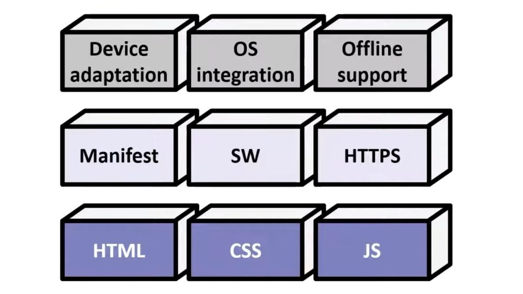
That’s why geospatial site maps are being built with Progressive Web App (PWA) capabilities in mind.

For builders, this means:

  • Site maps that can be installed on tablets like a native app
  • A full-screen, distraction-free experience for buyers
  • Continued access even when internet connectivity drops

It’s a practical solution to a daily frustration that many teams simply accept today.

Diagram showing blocks representing Device adaptation, OS integration, Offline support, Manifest, SW, HTTPS, HTML, CSS, and JS.

Why This Approach Works for Builders

Rather than competing on scale or complexity, this platform is built around how builders actually work.

The goal isn’t to lock you into long-term contracts. It’s to provide tools that become genuinely useful, tools your team wants to use because they make everyday work easier and buyer conversations more straightforward.

Interactive Geospatial Site Maps are designed to fit into your existing process, elevate your website, and help buyers better understand the value of your communities.

Want to See It Applied to Your Communities?

If you’re curious how Interactive Geospatial Site Maps could work for your neighborhoods, lots, or sales process, we’re happy to show you.

No hard sell, just a walkthrough and a conversation.

Learn About Interactive Geospatial Site Maps give Kevin a shout out to get a demo today!

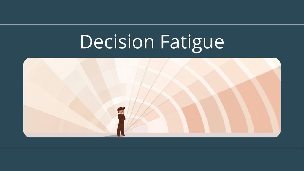
Decision Fatigue in the Design Studio: Why Too Many Choices Can Cost You the Sale

Tabitha Warren · 09/14/2026 · Leave a Comment

The design studio should be the fun part of buying a new home. So why do so many buyers leave exhausted? A look at decision fatigue, and how guiding choices helps buyers feel confident and spend more.

A while back I stopped into a paint store for one gallon of “white.” Just white. I walked out forty minutes later with no paint, a mild headache, and a fan deck of two hundred shades of white that all looked identical and somehow completely different. Swiss Coffee. Alabaster. Cloud Cover. Pure White, which apparently is not the same as Simply White, which is also not the same as plain old White.

I never bought the paint that day. I went home, sat on it for a week, and eventually picked the one the guy behind the counter pointed at first.

That, in a nutshell, is decision fatigue. And if it can stop a grown adult from buying a single can of paint, imagine what it does to a buyer standing in your design studio trying to make a hundred decisions about the biggest purchase of their life.

The Studio Should Be the Best Part. Often It’s the Hardest.

Walk a buyer into the design center and the energy is usually great. This is the room where the house becomes their house. Cabinets, countertops, flooring, fixtures, backsplash, paint, hardware, lighting—the list goes on.

And that is exactly where things can go sideways.

When you put every finish, every upgrade, and every option in front of someone all at once, you are not empowering them. You are overwhelming them. What started as excitement quietly turns into pressure, second-guessing, and that glassy-eyed look we have all had standing in front of two hundred shades of white.

A Little Psychology: The Paradox of Choice

There is a well-documented idea behind this. Researchers call it the “paradox of choice.” The short version: a few good options motivate us, but too many options freeze us. More choices feel like freedom right up until they tip into anxiety, and then we stall.

The famous study on this involved a grocery store and jam:

  • Small Selection: When shoppers were offered a small handful of jams to sample, a healthy share bought a jar.
  • Large Selection: When they were offered a giant display of two dozen jams, far more people stopped to look, but almost no one actually bought.

Same product. Same store. The only thing that changed was the number of choices, and the bigger menu sold less.

Sound familiar? It should. A design studio with an unguided wall of every possible selection is the jam display. It draws people in and then quietly talks them out of buying.

What Decision Fatigue Actually Costs You

Here is the part that should get a builder’s attention, because this is not just about a pleasant experience. An overwhelmed buyer does not upgrade more. An overwhelmed buyer does one of three things:

  1. They freeze. Decisions get pushed to “let me think about it,” and momentum dies.
  2. They defer. They ask to come back later, and “later” has a funny way of becoming never.
  3. They default to the minimum. When in doubt, people pick the safe, base option just to be done, and your upgrade revenue walks out the door with them.

Confident buyers spend more. Exhausted buyers spend less, and sometimes they do not spend at all. The cost of decision fatigue shows up right there on the final selection sheet.

The Fix Isn’t Fewer Choices. It’s a Better Path Through Them.

I want to be clear, because builders sometimes hear “decision fatigue” and assume the answer is to strip down their options. It is not. Buyers love personalization, and your options are a big part of what makes a new home special.

The fix is not fewer choices. It is a better-guided journey through them. A few principles go a long way:

  • Sequence the decisions. Do not hand someone the entire catalog on day one. Move through selections in a logical order: big structural and layout choices first, then finishes, then the fun finishing touches. One confident “yes” makes the next one easier.
  • Curate before you present. Instead of “here are all forty flooring options,” try “here are the three that work best with the package you have chosen.” You are not removing freedom. You are removing friction.
  • Let buyers see it, not just read it. A spreadsheet of options is a chore. Seeing your actual choices come to life is a thrill. This is where the right visual tools change the entire conversation.

Where the Right Tools Come In

This is the part Outhouse cares about, because the design studio experience does not start in the studio anymore. It starts online, long before a buyer ever sits down with a design consultant.

When a buyer can use an interactive floor plan to add a structural option and instantly see the change, or use an option visualizer to swap a countertop or cabinet finish and watch the room update in front of them, something important happens.

The decision stops being abstract. They are not imagining what “Linen vs. Greige” might look like. They are seeing it. And a buyer who can see the difference makes the call with confidence instead of dread.

Done right, these tools do a lot of the curating and sequencing for you. They let buyers explore on their own terms, narrow things down before they ever walk in, and arrive at the studio excited and halfway to a decision rather than bracing for a marathon.

That is the difference between a design process that builds confidence and one that builds fatigue.

A Quick Gut Check

Next time you are in your design studio, watch a buyer’s face. Are they leaning in, or are they getting that two-hundred-shades-of-white look? Ask yourself:

  • Are we presenting choices in a smart order, or all at once?
  • Have we curated, or are we handing buyers the whole catalog?
  • Can buyers see their options, or only read them on a list?
  • Does our process leave people confident, or exhausted?

The builders who guide the journey are the ones whose buyers say yes more often, and yes to more. Everybody wins, and nobody goes home with a headache and no paint.

Let’s Make Your Design Experience Easier to Say Yes To

If your selection process feels more like the jam display than a guided experience, we should talk. Outhouse helps builders turn an overwhelming wall of options into a clear, confident, visual journey from interactive floor plans and option visualizers to the tools that let buyers fall in love before they ever set foot in the studio.

 or reach out to your account manager, and let’s build a design experience your buyers actually enjoy.

Contact the Outhouse team

VR Tours for New Home Sales: How They Work, What They Cost, and When They’re Worth It

Tabitha Warren · 08/31/2026 · Leave a Comment

Person wearing a white VR headset and hand controllers, with arms raised as they interact with a virtual Tour.

A model home and a VR walkthrough are trying to solve the exact same problem: convince someone to trust a house they haven’t stood inside yet. One does it with lumber, drywall, and a decorator’s budget. The other does it with a headset, a browser tab, or a phone screen. Both cost real money. Only one of them can be finished before the foundation is poured.

We wrote earlier this year about where VR is headed by 2045 (see the post): headsets, avatars, weekend “test drives” of a life not yet built. This post is about where it already is, right now, for a builder deciding whether to spend the money this quarter.

The question that actually matters isn’t “should we do VR.” It’s which format, built from what, delivered to whom, and whether the number on the invoice makes sense for the buyer standing in front of you. Those four questions have real answers. Here they are.

Here’s the short version before we get into the mechanics: the investment pays for itself before you’ve broken ground, across long distances, and at scale; it doesn’t pay for itself everywhere, and we’ll get to exactly where that line falls.

“VR Tour” Means Three Different Things

“VR tour” gets used as a catch-all for at least three distinct technologies, and builders get burned when they buy one thinking they ordered another.

A 360° tour is a set of panoramic photos stitched together at fixed camera positions. A buyer can look around from where the camera stood, but can’t walk anywhere the camera didn’t go; the format carries no real spatial data. It runs on any phone, costs almost nothing, and it’s the right tool for a completed model that just needs to go online.

A Matterport-style 3D scan is a different animal entirely. A LiDAR or depth sensor captures the actual dimensions of a built space and turns it into a navigable digital twin, complete with a measured floor plan and a dollhouse view a buyer can spin around. This is the standard for a finished model home. It needs a real, physical room to scan, which is exactly its limitation.

A true VR walkthrough is the one that matters most for pre-construction sales, because it doesn’t need a finished room at all. It’s built in a real-time engine (Unity or Unreal, most often) directly from the CAD or Revit file your design team already produced. That’s worth sitting with for a second: the drawings you already have are the raw material. A buyer can tour a floor plan that exists only on paper, choose finishes, and walk the layout with a headset or a browser before a single stud goes up.

None of this requires a headset anymore, and that’s the biggest shift since last year. Every major browser now supports WebXR, so a buyer taps a link in a text message and walks through the home right on their phone. Requiring an app download instead of a browser tour cuts engagement by half to two-thirds.1 The headset used to be the entry fee. Now it’s the premium option, reserved for a developer-owned sales gallery rather than something you hand a buyer at home.

What Each Tier Actually Costs

Here’s where the range runs, as of this year. A 360° photo tour costs free to $500 and needs no headset. A Matterport-style scan runs $100 to $1,200 per property, plus a monthly software fee if you’re not outsourcing the capture. A custom VR walkthrough built from your own CAD files runs $20,000 to $50,000 for a single home, more for a full community reused across multiple lots. A custom Apple Vision Pro sales gallery app runs $5,400 to $90,000, depending on how many floor plans and finish options it needs to carry.2

Those aren’t hypothetical numbers. Dennis Ciani at Pacesetter Homes in Austin spent about $14,000 on a VR tour of a brand-new home design when the physical model wouldn’t be framed in time for a grand opening; five competing builders already had furnished models open down the street.3 Santiago Arana at The Agency in Los Angeles worked with an architect who spent $15,000 on a VR tour for a 10,000-square-foot custom oceanfront home. Buyers walked the pool, the landscaping, the ocean view; none of it existed yet.3 Set either number against what a single physical model home costs to build, furnish, and staff for a year, and the math starts to look different.

Does It Actually Work?

The most rigorous answer we’ve seen comes from a 2025 University of Texas at Dallas study of nearly 43,000 properties, published in Information Systems Research. Homes with a VR tour sold in 19 days on average instead of 34, a 44% reduction, after controlling for size, age, and neighborhood. The same study found no bump in final sale price.4 As UT Dallas researcher Dr. Zixuan “Maggie” Meng put it, the tool doesn’t make a house worth more; it makes buyers decide faster.

Sell faster, not higher. That’s the honest claim the data supports, and it’s still a good one. Listings with a 3D tour get 87% more views, per LCP Media’s 2026 figures, and 74% of buyers now say they won’t visit a property at all without seeing a tour first.1 A tour isn’t decorating your listing. It’s the thing deciding whether a buyer shows up in person at all.

Virtual user manipulating an interactive floor plan.

When the Investment Earns Itself Back

It earns itself back before you’ve broken ground: a pre-sale community, a custom or luxury home, anything where the alternative is asking a buyer to sign based on a floor plan and their own imagination. It earns itself back across distance: an out-of-state buyer, or a family making the decision together from three different cities (we’ve written before about the distributed, multi-generational buyer who needs exactly this kind of tool to close that gap). And it earns itself back at scale: one $30,000 VR build reused across forty lots in a community is a very different number than the same build for a single custom home.

It doesn’t earn itself back everywhere, and it’s worth saying plainly. A production builder running one community, selling mostly to local buyers who can drive to a finished model this weekend, doesn’t need a real-time VR engine. A Matterport scan of the model home, or even a clean 360° tour, does the job for a fraction of the cost. The right tool matches the buyer you actually have, not the buyer a vendor is hoping to sell you.

Three Questions Before You Sign

Ask any vendor three things before you commit budget. Can they build from the CAD or Revit files you already have, or will they charge you to model the house a second time? Does the tour run in a browser without an app or a headset, since that’s where most of your buyers will actually open it? And who updates it when the finish package changes next quarter, because a VR tour showing last year’s cabinets does more harm than no tour at all.

This is the corner of the business we’ve spent thirty years standing in: the space between a set of drawings and a buyer who believes what they’re looking at. We build tours, scans, and animations from the same CAD files your team already has, so the question was never really whether VR works. It’s whether the tour you’d be buying matches the buyer walking through your door today, or the one from five years ago.

See what that looks like:

LEARN MORE

Quick Answers

A 360° tour is a set of panoramic photos taken at fixed camera positions; a buyer can look around but can’t walk anywhere the camera didn’t go, and it requires a finished, built space to photograph. A true VR walkthrough is built in a real-time engine directly from a CAD or Revit file, so it can show a home that hasn’t been framed yet, and a buyer can walk the full layout rather than view it from fixed points.

Costs range from free for a basic 360° photo tour to $500, $100 to $1,200 for a Matterport-style 3D scan, $20,000 to $50,000 for a custom VR walkthrough built from CAD files, and $5,400 to $90,000 for a custom Apple Vision Pro sales gallery app, depending on scope.

Yes. A 2025 University of Texas at Dallas study of nearly 43,000 properties found homes with a VR tour sold in 19 days on average instead of 34, a 44% reduction, after controlling for size, age, and neighborhood. The same study found no measurable increase in final sale price: the tool speeds up the decision, it doesn’t raise the number.

No. As of late 2025, every major browser supports WebXR, so a buyer can open a VR tour from a link on their phone with no headset and no app download required. Headsets like the Meta Quest 3 and Apple Vision Pro are now used mainly for developer-owned sales galleries, not for tours sent directly to buyers.

Footnotes

1  MadXR, “WebXR and Browser-Based Immersive Experiences,” February 2026; LCP Media, 2026 real estate media engagement data.

2  Frame Sixty, “Virtual Reality Property Walkthroughs: Cost, Technology, and How to Get One Built,” July 2026.

3  Michele Lerner, “Virtual Reality: Visualize Your Way into a Custom Home,” NewHomeSource, April 2026.

4  University of Texas at Dallas and University of Washington, study of 43,000 properties, published in Information Systems Research, September 2025.

Why Homebuyers Trust a Rendering More Than a Floor Plan

Tabitha Warren · 08/17/2026 · Leave a Comment

Hand a homebuyer a floor plan and watch what happens. They stare at it. They rotate it. They squint at it sideways. And then they say the thing we have all heard a hundred times: “I just can’t picture it.”

Now show them a rendering of that same home, with afternoon light pouring through the kitchen windows and the right furniture in the right rooms. Watch their face change. Watch them start pointing. Watch them lean in.

That shift is not about aesthetics. It is about how the human brain actually works; and once you understand it, you may also start to see how your floor plans and your renderings are doing very different jobs for the same buyer.

Buyers Don’t Buy Houses. They Buy Feelings.

Let’s start with what most of us in this industry already know, even if we don’t always name it directly: homebuying is not a rational process, even when buyers think it is. Research consistently shows that more than 60% of buyers choose based on emotion over reason, and that gut feeling often shapes the decision long before any spreadsheet does.

A Zillow survey found that half of all homebuyers cried at least once during the process. (If you have spent any time in a sales center or at a final walkthrough, this number probably does not surprise you.)

Which means the tools you use during that process need to speak to the emotional brain, not just the logical one. And here is where the difference between a floor plan and a rendering starts to matter in a very specific way.

Two Systems, One Decision

Here is something worth knowing: the human brain does not process images and symbols the same way. It uses two separate systems, and they serve very different functions.

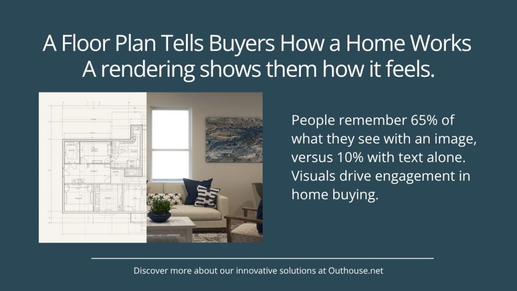
The symbolic system handles language, logic, and abstract representation. The visual system handles imagery, spatial experience, and emotional response. Images engage more of the brain at once and tend to stick longer. Research on memory shows that people retain about 10% of text-only information three days after seeing it; add an image, and that number jumps to 65%.

The practical implication for anyone selling homes: a floor plan and a rendering are not interchangeable tools. They are speaking to different parts of the buyer’s brain; and understanding that distinction changes how you think about which tool to use, and when.

What a Floor Plan Is Actually Good For

None of this means floor plans are the wrong tool. They are not; they are an essential part of how buyers understand a home. (At Outhouse, we produce interactive floor plans alongside our renderings, and we are genuinely proud of what a well-designed floor plan can do.)

A floor plan answers the analytical brain: how does the traffic flow? Where does the living room sit relative to the kitchen? How does the master suite relate to the secondary bedrooms? These are real questions that matter to buyers; and a clear, well-organized floor plan answers them in a way a rendering simply cannot.

What a floor plan cannot do is create emotional conviction. It can show a buyer that the kitchen is fourteen by sixteen feet; it cannot show them how it will feel to cook dinner there on a Tuesday night with their family. That gap between understanding and feeling is where buyers stall, where they second-guess, and where the “I just can’t picture it” moment happens.

What a Rendering Does Differently

A rendering picks up exactly where the floor plan leaves off. It does not ask the buyer to imagine anything; it gives them the experience their brain was already trying to construct.

Before anything is ordered, framed, or installed, a photorealistic rendering lets a buyer stand in the finished kitchen, look at the countertop they selected against the cabinets they specified, and see how the light hits the flooring they almost went with. That is an experience a sample board and a two-dimensional drawing simply cannot replicate.

When a buyer approves a rendering, they are not just saying they like the picture. They are signing off on a shared visual standard. That becomes the reference point for every conversation that follows. Instead of “this is not what I thought it would look like,” you get “this is exactly what we agreed on.”

The emotional connection happens earlier. The confidence is higher. And the second-guessing, the mid-build calls, the change orders that begin with “I know we already discussed this, but…” happen far less often.

When Both Work Together

Here is what we have learned from working with production builders across the country: the most effective visualization approach is not renderings instead of floor plans. It is renderings and floor plans, used strategically, so that buyers get what each one is uniquely equipped to give them.

The floor plan answers the analytical brain: here is how the home works. The rendering answers the emotional brain: here is how the home feels. A buyer who has both is a buyer who understands their decision and feels good about it; and that combination is where real confidence comes from. Confident buyers close without regret. They move in without the nagging sense that they should have chosen differently. And they recommend you to their neighbors.

Think of it as a complete picture in the most literal sense: two different lenses, both necessary, each doing what the other cannot.

The Trust Equation

There is one more dimension worth naming, and it is trust.

Buying a home is one of the highest-stakes financial decisions most people will ever make. When a buyer hands over a deposit on a home that has not been built yet, they are placing enormous trust in you as a builder. The tools you give them during that process either reinforce that trust or quietly erode it.

A floor plan alone says: here are the facts; now imagine the rest. A rendering says: here is exactly what we are going to build for you. And when both are present, the message becomes something even more powerful: we have thought this through completely, and we want you to feel as certain as we do.

Visual clarity reduces hesitation. It shortens sales cycles. It reduces the mid-build conversations that drain your team’s energy and your company’s goodwill. When buyers can both understand it and see it, they believe it. When they believe it, they buy with confidence.

The Bottom Line

Floor plans are not going away, and they should not. They are essential tools for any buyer who needs to understand a home structurally; and when they are designed well, they do that job beautifully.

But for a buyer who is trying to fall in love? They also need to see it. Not instead of the floor plan; alongside it. Together, they give buyers something neither can give alone: the full picture of the home they are about to make their own.

Need help creating visuals for your home buyers?

Learn more

Sources

¹ Emotional decision-making in homebuying: BethGHomes.com, “The Psychology of Home Buying: Understanding Buyer Behavior.” bethghomes.com

² Buyer emotional experience: Zillow (via Builder Lead Converter). builderleadconverter.com

³ Image vs. text retention (picture superiority effect): Learning Loop, “Picture Superiority Effect: Improve Recall with Images.” learningloop.io

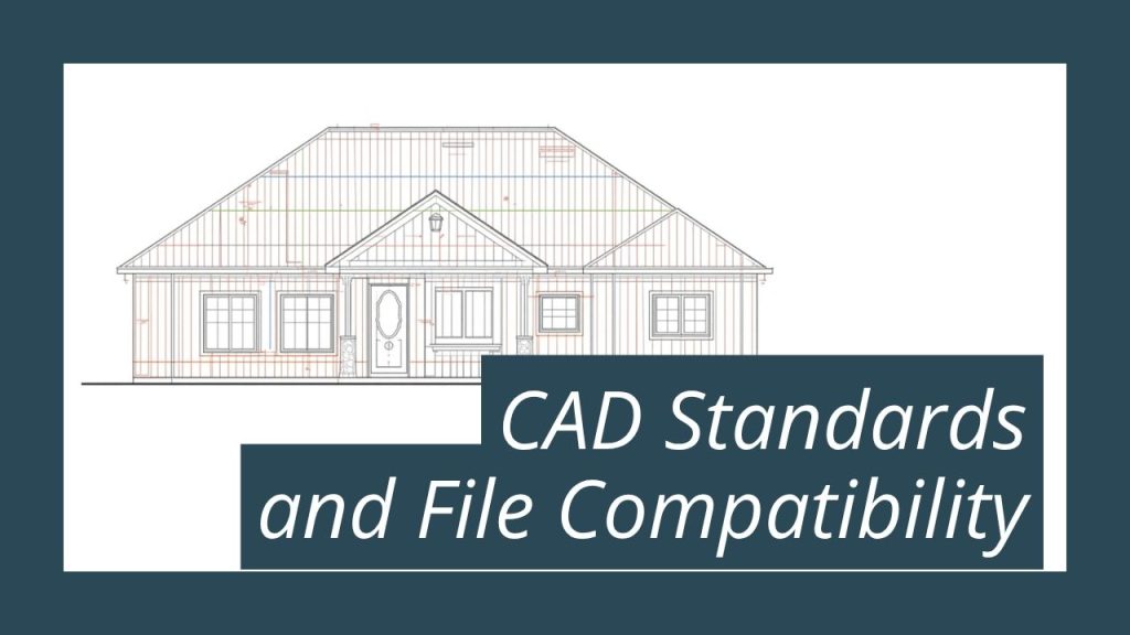
CAD Standards and File Compatibility: What Your Partners Need to Know

DevTeam · 08/03/2026 · 1 Comment

Most builders assume everything is fine with their drafting process. Plans get drawn. Homes get built. What almost nobody talks about is what happens to those files after the design is done, once they move into the hands of everyone who has to work from them next.

I’ve spent more than twenty years watching this play out, and I’ve come to know the pattern pretty well. The builders who struggle most with field errors, permit delays, and slow marketing turnaround almost never trace the problem back to where it actually started. It’s the inconsistency living inside the actual CAD files. Almost always.

The Assumption That’s Costing You

Here’s what most people get wrong about CAD standards. They think standardizing construction documents means limiting who designs for you.

It doesn’t.

You can hire any architect you want. The regional specialist who knows your jurisdiction inside and out. The emerging designer producing the most interesting floor plans in your market. Multiple firms for different communities in the same year. None of that has to change.

What has to be consistent is the construction document layer: the DWG files that translate an architect’s design into the instructions your field crew, permit office, and marketing vendor are all working from. One team can manage that layer, working to one standard, no matter how many architects designed the original plans.

This isn’t a constraint on your design choices. It’s the infrastructure that protects them and lets them actually last.

What Inconsistency Actually Looks Like in the Field

When the construction document layer isn’t consistent, here’s what shows up, and it shows up for real people trying to do their jobs.

Field crews encounter different conventions between plan types. A dimension that’s clearly labeled in one format gets buried in a non-standard layer in another. The crew makes a call. Sometimes it’s right. Sometimes it costs you a change order and a bad afternoon for whoever’s responsible for framing.

Permit sets take longer. Reviewers look for specific information in the same location across packages. When the formatting varies, the review cycle stretches out, not because anything is wrong with the design, but because the documentation doesn’t speak one consistent language.

Marketing production slows to a crawl. When your plan library comes from three different architects, in two different DWG versions, with different layer naming conventions, every visualization project starts from scratch. No compounding efficiency. Every new plan is a fresh negotiation with the file, and somebody on your team is the one having that negotiation at 6pm on a Friday.

Research in construction documentation puts the cost of drawing-related errors at three to five percent of total project costs in dispute resolution and corrections alone. Rework caused by drawing errors can run five to ten times the cost of the original installation work. That math doesn’t even touch the slower marketing timelines, the delayed sales materials, or the market windows that quietly narrow while the files get sorted out.

The Part of This Equation Most Builders Miss

Here’s where the real cost hides. It’s not just construction documents. It’s everything those documents feed.

A clean, standardized DWG file flows through your entire operation. Your structural engineer works from it. Your MEP subs reference it. The permit office reviews it against a consistent standard. And the same file that guides your framing crew becomes the foundation for your interactive floor plan, your 3D exterior rendering, your print brochure, your sales office display. When the source is consistent, every one of those downstream steps runs cleaner, faster, cheaper for the people doing the work.

An inconsistent source file creates friction at every one of those steps. Not the catastrophic kind you notice all at once. The slow kind. A revision request here. A delayed deliverable there. A marketing package that takes three weeks instead of one. It accumulates quietly, and it accumulates on somebody’s desk, until you compare what your production timelines look like now against what they looked like when your plan library was smaller and simpler.

Why We Built Outhouse the Way We Did

This is actually the reason Outhouse exists in the shape it does.

In the late 1990s, three companies were already working side by side with the same builders: a drafting firm, a rendering and animation company, a digital print and interactive graphics operation. They weren’t the same company yet, but they were sharing files constantly, because the DWG file one team produced was the starting point for what the next team built.

They merged because they’d already learned something important, something that came from watching each other’s frustration up close: the construction document is not just a building instruction. It’s the source file for everything your buyer sees before they walk through the door. When it’s managed consistently, everything downstream runs. When it’s not, everybody pays, usually in ways nobody traces back to the file.

After almost three decades, that founding insight still holds. A clean and accurate set of plans builds a lot more than a well-constructed home. It builds the whole experience the buyer has before they ever pick up the keys.

What This Means for How You Work With Architects

The decision isn’t which architect to use. That’s a design decision, and it should stay that way: made on creative merit, local knowledge, and the needs of the community you’re building.

The decision is who manages your construction documents, and what standard they work to. If the answer is “whoever we hired that year,” you’re accumulating inconsistency with every new plan, inconsistency that compounds as your library grows and your partner list expands.

One CAD standard. Any architect you choose. That combination isn’t a limitation. It’s what keeps your operation from being rebuilt from scratch every time a new designer comes into the picture.

If you’re not sure what your files actually look like to the people working from them, that uncertainty is worth paying attention to. We’ve walked through a lot of builder plan libraries over the years, and the ones that hold up, the ones that compound value instead of quietly losing it, all look the same at the source: consistent, clean, built to work with everyone from the first drawing forward.

Ready to standardize your plan library?

learn more

Visualize This

Jim Sorgatz · 07/20/2026 · Leave a Comment

Why the Stakes for Great Visual Marketing Have Never Been Higher

The Temple of Jupiter, Split, Croatia at night.

I’ve been fortunate enough in my travels to stumble onto places that stop you cold. Croatia is one of them. It belongs on every list.

Walking into the Old Town in Split for the first time, arriving by water at dusk, is one of those experiences that makes language feel completely inadequate. The limestone buildings glow against the night sky. The narrow catacombs leading from the dock into the heart of the city feel like they could belong to any century. And then suddenly you’re standing in what was once a Roman emperor’s palace, now packed with apartments, restaurants, and a nightclub tucked under ancient arches, with residents going about their Tuesday like this is perfectly normal. Because for them, it is!

I took hundreds of photos on that trip. Not one of them fully captured what it felt like to be there. A photo is better than a written description, but even a photo falls short of the real thing.

And here’s what that experience reminded me: that gap between description and experience is exactly what great visual marketing exists to close.

The Same Holds True for Your Homes

Gathering of people sitting under canopies in Spit Croatia.

Describing a beautiful bedroom with a tray ceiling and a pair of windows that flood the room with morning light is one thing. Showing it is something else entirely.

That has always been true. What has changed dramatically is how much it now costs a builder to get it wrong.

Your buyer’s first showing of your home isn’t happening in a model. It’s happening on a phone screen, often during a lunch break, while they’re comparing three other communities at the same time. Our colleague Tabitha Warren made a compelling case in a recent post that the brain makes a brand assessment in just 2.5 seconds. When your visuals are flat, poorly lit, or just shy of realistic, buyers don’t consciously think “bad rendering.” They just feel like something isn’t quite right. And they move on.

That’s not a technology problem. That’s a trust problem.

The Bar Has Moved

Here’s something worth paying attention to as we move through 2026: the design trends dominating new home construction right now are precisely the ones that are hardest to render convincingly.

Organic Modernism has become the defining aesthetic of the moment: lime-wash walls, white oak cabinetry, tumbled stone, linen textures. These materials communicate warmth, craft, and intentionality. They are also inherently tactile. The depth of a lime-wash surface shifts with the light. White oak grain catches angles differently as you move through a room. Tumbled stone carries shadow and dimension that a standard render can’t resolve.

When a rendering flattens those surfaces, when the grain maps as a flat texture and the lime-wash reads as paint, something feels off to the buyer. They may not be able to say why. But the doubt fires all the same.

Buyers aren’t just evaluating your floor plan. They’re evaluating whether they can trust you to build the home they’re imagining. Your visuals are part of that answer, and right now they’re answering that question in the first few seconds of a digital experience that happens long before anyone sets foot in your sales office.

beautifully made bedroom with white sheets and teal pillows.

What the Numbers Tell Us

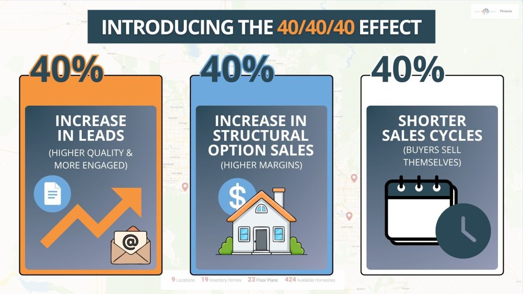
At Outhouse, we’ve been tracking buyer behavior across our platform since 1994. The data Kevin Weitzel shared in a recent post is worth knowing well: builders using interactive floor plans see a 40% increase in qualified leads, a 40% lift in structural option sales, and a 40% shorter sales cycle.

That is not a small improvement. That’s a fundamental shift in how buyers move through the sales process.

The reason isn’t complicated. The more a buyer can visualize and personalize their home before stepping into a sales office, the more emotionally invested they are when they arrive. They’ve already started to imagine living there. You aren’t starting a sales conversation. You’re confirming a decision they’ve already begun making in their own mind.

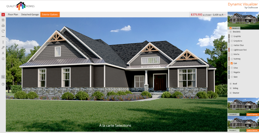
Interactive Floor Plans move buyers from browsing to belonging. Exterior visualizers let them see their home in the finishes and colors they actually want, not a generic approximation decided by someone else. And high-fidelity renderings of the specific materials that define 2026 design tell a buyer something important: that you understand what beautiful means to them right now, not five years ago.

Explore options exterior visualizer.

Bringing It Together

The question builders used to ask us was, “Do we really need this?” Nobody asks that anymore. The question now is, “Are ours good enough?”

That is a much better question. It acknowledges that visualization matters. What it’s really asking is whether your visuals are closing the gap between description and experience, or whether they’re leaving buyers with that vague, nagging feeling that something isn’t quite right.

At Outhouse, we believe your visual standard should match your build standard. We’ve been helping builders make that case to buyers for over thirty years, and the tools available today are extraordinary. From photorealistic renderings built on Organic Modernism materials to Interactive Floor Plans that let buyers configure their own home, to full-platform solutions that carry a consistent visual identity from the website to the sales kiosk to the print collateral in the model home.

A picture still paints a thousand words. In 2026, it also has to earn the trust it takes to sign a contract.

Croatia taught me that some places simply have to be seen to be believed. Your homes deserve the same chance to speak for themselves.

Ready to see what your homes could look like?

Contact the Outhouse team.

The $800,000 Model Home Problem, and the Visualization That Solved It

Tabitha Warren · 07/06/2026 · 1 Comment

Building a model home and building a virtual walkthrough are doing the exact same thing: helping a buyer feel certain about a home that doesn’t fully exist yet.

One costs $800,000. The other costs a fraction of that, and reaches every buyer who’s looking, not just the ones who drove to your community on a Saturday.

That’s the realization that changed how I think about marketing in homebuilding. Not as a technology argument. As a math problem.

I wrote last year about how the brain makes a brand judgment in 2.5 seconds, and what that means for the quality of your visuals. This post is about what it costs when those visuals aren’t ready for that moment.

The Real Weight of $800,000

I’ve sat across the table from builders who could quote me this number down to the last landscaping invoice. They know it because they have to account for every dollar of it.

A model home isn’t just a house. It’s a premium version of your best floor plan, loaded with every upgrade you hope buyers will select, then professionally staged, landscaped, staffed, and maintained as a non-revenue-generating asset for the life of the community. Construction with premium finishes typically runs $75,000 to $150,000 above a standard build (model homes carry 20–25% in upgrades by design). Ongoing staging and furnishing rental over a 2–3 year community lifecycle adds another $50,000 to $120,000. Then come the carrying costs: maintenance, utilities, staffing, insurance, accumulating month after month.

When it’s all accounted for, you’re looking at $600,000 to $800,000 in total investment.

For that investment, a well-trafficked model home reaches a few hundred to a couple thousand visitors over its lifetime. Qualified visitors, yes. Motivated visitors, often. But a finite number, in one location, on your schedule.

A couple thousand people. That’s what $800,000 buys you.

The Math That Changed My Thinking

A photorealistic 3D rendering package (the kind that lets buyers walk through their future home before the foundation is poured, swap finishes in real time, and see the elevation in both morning and afternoon light) runs $10,000 to $50,000 for a comprehensive package. At the accessible end, a $5,000 to $10,000 investment gets you interactive floor plans, photorealistic exterior elevations, and a full interior virtual tour.

Those assets don’t close at 5 PM. They don’t take weekends off. They reach buyers in Phoenix at 10 AM and buyers relocating from Chicago at midnight.

And here’s the thing: the performance data on what happens when they do is remarkable. According to Matterport’s Real Estate Impact Report, listings with 3D virtual tours sell up to 31% faster and command prices up to 9% higher. Outhouse platform data tracked by Kevin Weitzel shows properties offering a seamless digital experience generate 40% more buyer engagement. And according to the National Association of Realtors’ 2025 Home Buyers and Sellers Generational Trends report, buyers who take a virtual tour are 95% more likely to contact a sales agent.

That last number changes the conversation in the sales office. A model home visitor showed up because they were already interested. A virtual tour converts people who were still on the fence and sends them to you ready to move.

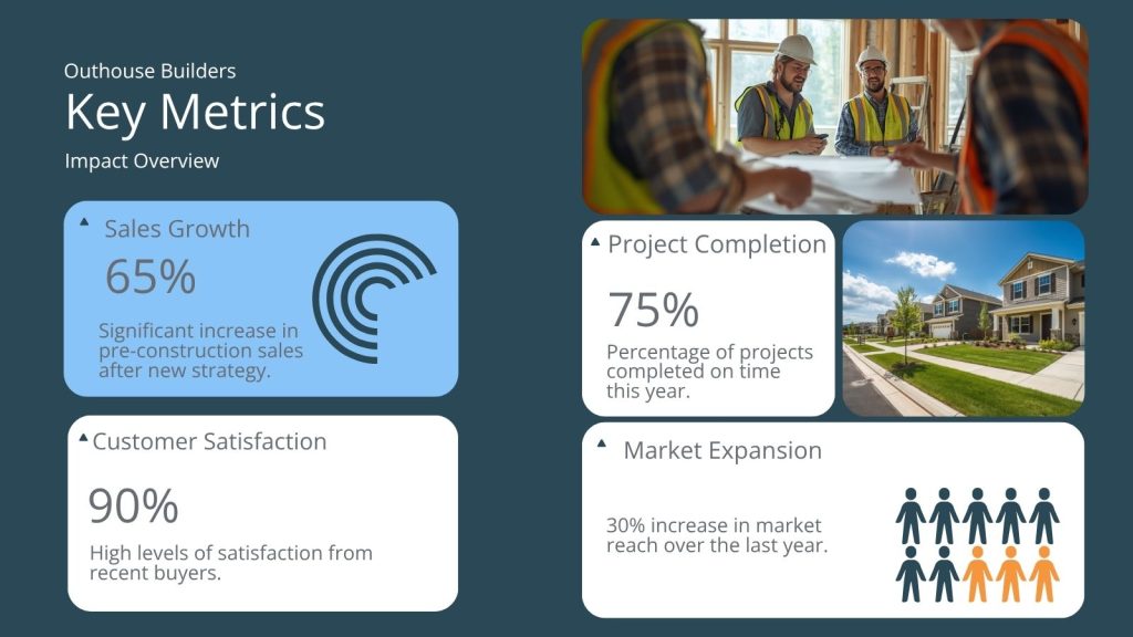
What 65% Pre-Construction Sales Actually Looks Like

One of our Phoenix-area builder clients came to us running about 12% pre-construction sales. Their model home was performing exactly as expected, drawing qualified traffic and generating strong feedback, but pre-sales were stalled.

We rebuilt their digital visualization package: interactive 3D walkthroughs of their three flagship plans, photorealistic renderings with the full upgrade path, a finish visualizer that lets buyers see real-time countertop and flooring options. Within three months, pre-construction sales climbed to 65%.

The model home didn’t change. Physical traffic held steady. What changed was the buyer who had never driven to the site (the one comparing communities from her kitchen table at 9 PM) built confidence before the first appointment. When she arrived at the sales office, the decision was already made. The visit just confirmed it.

We’ve watched this dynamic play out with builders across every market we work in. The decision window has moved, and most model homes aren’t there when it opens.

Before You Break Ground

The most underutilized advantage of going visualization first is what happens before construction starts.

Builders who let buyers A/B test finishes through pre-construction renderings (swapping countertop colors, exterior elevations, flooring packages) are collecting something more valuable than preferences. They’re collecting decisions. A buyer who has already seen her kitchen in warm white cabinetry with waterfall-edge quartz, rendered in photorealistic detail, doesn’t change her mind at the design center. Change orders drop. Timelines hold. Buyers arrive at closing having already lived in the home, mentally, emotionally, completely.

I’ve watched this play out enough times that the first time still surprises me. The visualization doesn’t just convert leads. It completes the design process earlier and removes the friction that quietly eats margins on the back end.

The Question Builders Are Actually Asking

The model home isn’t going away. There will always be buyers who need to stand in a space before they believe it, and that experience is real and irreplaceable. I understand it; I’ve sat on Zillow at 11 PM comparing communities I had no intention of driving to that weekend.

But for every buyer who needs to stand in the room, there are two more making their decision from a screen, comparing your community to a competitor’s, late at night, with no one to answer their questions.

The $800,000 model home reaches the people who come to you. The right visualization package reaches everyone else.

That’s not a technology story. That’s a math problem with a clear answer.

At Outhouse, we’ve spent thirty years helping builders close the gap between what a home can do and what a buyer can understand. The visualization package that moved a Phoenix-area builder from 12% to 65% pre-construction sales in three months isn’t a secret. It’s a proven approach to a math problem that too many builders are still solving with a single physical asset.

Ready to see what this math looks like for your community?

Contact the Outhouse
team today.

The Multi-Generational Explosion: Marketing the “Zoned” Revolution

Tabitha Warren · 06/22/2026 · Leave a Comment

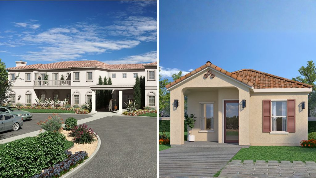
Split image of the front of two houses
Multigenerational home and ADU

We’ve been making the case in this space that the housing industry’s greatest risk isn’t trying something new; it’s continuing to build for a market that no longer exists. We’ve talked about the gap between affordability and attainability. We’ve talked about who’s competing for starter homes before first-time buyers even get a shot.

We know that pressure because we carry versions of it ourselves. Every decision about which tools to invest in, which capabilities to build, which bets to make in a shifting market; we’ve sat with that uncertainty. If that sounds like where you are right now, this post is for you.

Today we’re talking about a market segment that is quietly solving its own attainability problem. Most builders are still marketing it with the wrong vocabulary.

Fourteen percent of all home purchases in 2026 were made specifically to accommodate multi-generational living. That’s not a niche. That’s not a trend. That’s nearly one in seven transactions driven by a single underlying reality: when families pool resources across generations, the math of homeownership starts to work again in ways it simply doesn’t for a single income or a young couple going it alone.

The demand is there. The product is evolving. What hasn’t caught up is how builders are communicating it.

The Language Is Doing the Work Wrong

Walk into most sales centers today and you’ll hear the same terminology that’s been in use for thirty years. “Mother-in-Law Suite.” “In-Law Apartment.” “Guest Quarters.” These phrases aren’t wrong exactly; they’ve been the best vocabulary anyone offered the industry, and there’s no mystery in why builders are still using them. When a phrase becomes the category name, it sticks. Until something better comes along.

Something better has come along. We’ve started calling it “Zoned Living,” and the difference isn’t semantic. It’s structural.

A suite implies a secondary space (something added on, subordinate to the main house). Zoned living implies two complete, private worlds under one roof: dual primary suites, private-entry ADUs, sound-dampened flex zones that can serve as a nursery today, a home office in three years, and a caregiver’s suite in ten. The product can do all of that. The language hasn’t caught up.

And language does real work in a sales conversation. When a buyer hears “Mother-in-Law Suite,” they mentally subtract it from the home; it’s a feature for someone else, a concession to a family circumstance. When they hear “Zoned Living,” they start imagining their own configuration. Two entirely different psychological starting points, two entirely different conversations.

The builders winning the multi-generational market right now are, almost without exception, the ones who’ve made this shift in vocabulary before the competition did.

The Buyers Have Changed

The 14% figure in the 2026 NAR data tells a more nuanced story than it first appears.

It’s a slight decline from the 17% spike we saw in 2024; the mistake is to read that as the trend softening. The underlying drivers haven’t changed. Aging parents who need proximity but not loss of independence. Adult children who can’t carry a mortgage alone in this economy. A Gen Z cohort returning home after early career starts that didn’t land the way previous generations expected. And increasingly, arrangements driven not by necessity but by genuine choice: families who watched the pandemic reshape what proximity means and decided they want to live closer together.

That combination of drivers isn’t going away. The 2024 spike reflected COVID-era urgency. The 2026 number reflects normalized demand at a structurally higher baseline. One in seven home purchases. Sustained.

What’s also changed (and this is what makes this sale feel genuinely different to everyone navigating it) is who shows up to the sales center. And they don’t show up alone.

The traditional home purchase involves one decision-making unit with a relatively contained set of preferences. The multi-generational purchase involves two, sometimes three, stakeholders with genuinely different needs, different physical requirements, and different timelines. The 80-year-old who will live in the private suite has different priorities than the 45-year-old financing it. The adult child who wants a lockable private entrance has different concerns than the grandparent who needs single-floor accessibility.

Here’s what that can feel like from the sales floor: you’re trying to serve both the person who is buying and the person who will be living there, with different concerns and sometimes different ideas about what matters most. It’s not a harder version of the sale you already know. It’s a different conversation altogether.

And most sales tools weren’t built for it.

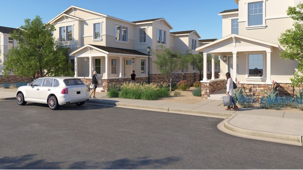
 Outside view of neighborhood with beautiful two story houses.

The Invisible Problem: Selling a Home Buyers Can’t See

This is where families run into the wall. Builders feel it too.

Our clients tell us, consistently, that the multi-generational buyer is one of the most motivated they serve and one of the most difficult to bring to a confident decision. The reason almost always comes back to the same thing: they can’t see what they’re buying. Not really.

For a standard single-family home, the visualization gap is manageable. A floor plan plus some renderings of the primary living areas gets the buyer close enough that they can fill in the rest. A bedroom is a bedroom; a kitchen is a kitchen. The imagination does the rest.

For a multi-generational home, the stakes are much larger; they’re emotional as much as they’re practical. The privacy, the separation, the acoustic independence, the way the private entrance actually feels when you walk from the shared living area to the secondary suite: none of it is visible in a 2D floor plan. You can show the dimensions. You can label the rooms. What you cannot convey is whether this configuration delivers what the family is actually buying: the feeling that two families can share a roof without sharing a life.

And behind every floor plan that fails to convey that, there’s a real family trying to make an enormous decision. A mother in Phoenix trying to buy a home for herself and her parents who are still in Ohio. A daughter who has promised her aging father he’ll have his own front door, his own kitchen, his own sense of independence; she needs to show him what that means before he’ll believe it. These are people navigating some of the most emotionally complex decisions a family makes. And they’re often being asked to do it from a piece of paper.

That gap is where the sale falls apart. Not because the product isn’t right. Not because the buyer isn’t motivated. Because what they need to understand in their body (not their mind) is something the static plan cannot give them.

And when that gap doesn’t get bridged, a family that was ready to make this decision goes home uncertain. That’s the part we can’t stop thinking about.

Two things bridge that gap, and we’ve watched them work.

The Life Stage Visualization. Multi-generational buyers aren’t just buying a home for today. They’re buying a home for a family in motion. The nursery that becomes the teen suite that becomes the parent’s suite. The home office that becomes the caregiver’s room when the moment arrives. What our clients show us, consistently, is that buyers who can see those transitions make decisions with a confidence that buyers working from static materials never reach. The uncertainty lifts. The question shifts from “will this work?” to “when do we move forward?”

The Multi-Stakeholder Virtual Tour. The other challenge specific to multi-generational purchases is that the decision-making unit is often distributed. The adult child in Phoenix is buying with parents in Ohio. The grandparent who will live in the suite can’t make the trip to the sales center. High-fidelity virtual tours don’t just allow remote buyers to see the property; they allow a family to walk through a home together, in real time, from wherever they are. The grandmother can say “I don’t like that the suite is right next to the kitchen” and everyone is looking at the same thing. That conversation (the one that actually resolves the purchase) happens at the sales center for buyers who can be there. For everyone else, it either happens virtually or it doesn’t happen at all.

The Strategic Question

The builders winning the multi-generational market in 2026 aren’t winning because they have a better product than their competitors. Many of them are building the same floor plans. They’re winning because they’ve built the communication infrastructure to sell it.

That means the vocabulary: Zoned Living, not Mother-in-Law Suite. It means the visualization tools: interactive floor plans that show how a space changes, not static renderings of a single configuration. It means the sales process: one designed for a decision-making unit of three, not one designed for a couple.

Building that infrastructure isn’t free; we know that because we’ve made those calls ourselves. It requires investment in tools, in training, in rethinking how the sales conversation unfolds; every one of those decisions carries real weight when resources are finite and the return isn’t guaranteed. We’re not minimizing what that costs. We’re saying that the NAR data tells us this demand is sustained and structural; that the underlying drivers aren’t going away; and that every builder in production housing will be selling to multi-generational buyers whether they’ve built for it intentionally or not.

The question isn’t whether this market is coming. It’s here. The question is whether your marketing infrastructure can close it when it walks through your door.

What Outhouse Can Do

At Outhouse, this particular problem sits at the center of everything we do: the gap between what a multi-generational home can do for a family and what that family can actually understand before they sign. We don’t have a perfect answer for every situation; the sales process is genuinely complex and what works in one builder’s market doesn’t always translate cleanly to another. But we care deeply about getting this right (not just because it’s where we can help most, but because the families on the other side of these decisions deserve to make them with clarity and confidence).

The grandmother who can’t travel. The daughter who made a promise about her father’s independence. The family trying to decide whether this will actually work. When the tools are right, those families get to decide from a place of knowing. When the tools aren’t there, they’re guessing. We’re in this work because we believe that difference matters.

Interactive floor plans that show the life stage trajectory. Virtual tour technology built for distributed family decision-making. Design center tools that let multiple stakeholders configure the same space from different locations, in real time.

These aren’t future capabilities. Builders using them are winning the multi-generational sale today; the families they serve are making decisions they feel genuinely good about.

If you’re seeing this buyer in your sales center and not closing them at the rate your product deserves, we’d love to help. The infrastructure exists. The question is whether it’s working as hard as it should be for you.

Find out how Outhouse can help.

LEARN MORE

Footnotes

National Association of Realtors, 2026 Home Buyers and Sellers Generational Trends Report. The 14% figure reflects purchases made specifically to accommodate multi-generational household arrangements; the prior-year figure (17%) reflected elevated post-pandemic demand that has since normalized at a structurally higher baseline than pre-2020 levels.

Texture, Tone, and Trust: The Neuroscience of High-Fidelity Visualization

Tabitha Warren · 06/08/2026 · Leave a Comment

Front yard rendering of a Postmodern House.

The 2.5-Second Threshold

Curb appeal used to happen at the street. Now it happens on a smartphone screen, and the judgment window is tighter than most builders realize. 

Your buyer’s brain makes a brand assessment in just 2.5 seconds. In that heartbeat, they decide whether your brand represents quality or a compromise. When 3D renderings appear flat or poorly lit, the brain’s amygdala, the center for processing emotions and trust, can register a “fake” signal. In a market where trust is the primary currency, a low-fidelity image doesn’t just look bad; it creates subconscious doubt. 

Why the Moment Is Especially Demanding Right Now

Current 2026 design trends are dominated by Organic Modernism. This style relies heavily on tactile surfaces: lime-wash walls, white oak cabinetry, tumbled stone, and linen textures. These materials aren’t just colors; they are experiences defined by how light interacts with their surfaces. 

And here’s the thing: that’s exactly what makes them so demanding to render. Lime-wash has depth that shifts with lighting conditions. White oak has a grain that catches light differently at different angles. Tumbled stone carries shadow and dimension at scales a standard CAD export can’t resolve. When a rendering flattens those surfaces, when the grain maps as texture, when the lime-wash reads as paint, the amygdala fires. The buyer doesn’t know why something feels off. But something feels off. 

You aren’t selling a floor plan. You’re selling the feeling of home. And the materials that evoke that feeling most powerfully right now are the exact materials that demand the most from your visuals. 

Organic Modernism

The Technical Bridge to Certainty

Getting there means moving beyond “good enough.” It requires a commitment to physical accuracy in the rendering that matches the commitment to the actual construction. 

Two capabilities make the real difference. 

Global Illumination isn’t about adding a light source to a scene. It’s about simulating how light actually moves through a space, how it bounces, casts shadows, and shifts by the hour and the season. The sun hitting a breakfast nook at 8:00 AM in September creates a quality of light the brain recognizes as real before the conscious mind has processed anything. That recognition is what “sense of place” actually means, not a stylistic quality, but a neurological one. 

PBR  (Physically Based Rendering) uses advanced material science so buyers can practically feel the wood grain and the coolness of the quartz through the screen. When materials respond to light the way they would in the actual room, the brain’s “fake” detector stays quiet. Your buyer stops scrutinizing and starts feeling, and feeling is what buying is all about. 

Global Illumination

What the Data Shows

Neuroscience is backed by real outcomes. According to the Dodge Construction Network’s 2026 Outlook, builders using high-fidelity, photorealistic renderings see a 30% higher engagement rate than those using standard CAD exports. The reason is biological: high-fidelity visuals bypass the logical brain and trigger an immediate emotional response. 

The Institute of Residential Marketing reports that homes marketed with high-quality 3D visuals can command a 3–5% price premium during pre-sales. On a $600,000 home, that’s $18,000 to $30,000. Not because the home changed, but because the buyer’s perceived risk went down. When you provide visual certainty, you reduce the doubt that the amygdala was protecting against. 

Building Trust Through Detail

In a crowded market, the builders who earn trust earliest earn the most. And trust isn’t built through the sales conversation alone; it’s built in the 2.5 seconds before the conversation begins. 

When your visuals are indistinguishable from reality, you aren’t just showing a house. You’re demonstrating a standard of care, a signal that the quality of your construction and your communication are one and the same. 

The visual standard should match the build standard. At Outhouse, we believe that high-fidelity visualization is the shortest path to buyer confidence. We help builders bridge the gap between “imagining” and “knowing.” 

To see how we can bring your next project to life with neurological precision,

Explore our visualization gallery

The 40/40/40 Effect

Kevin Weitzel · 05/25/2026 · Leave a Comment

You can’t afford to do “X”?… but what if you can’t afford NOT to?

The Evolution of Buyer Expectations

For years, static floor plans on builder websites have been the norm. But today’s buyers want more, and frankly, they expect it.

Interactive Floor Plans aren’t new. Outhouse introduced the first version back in 1994. Since then, they’ve produced tens of thousands of IFPs for builders across the U.S. and Canada, tracking every interaction along the way. When you combine that data with insights from Google Analytics and real-world builder results, a clear pattern emerges, one that continues to hold up across case study after case study.

The Results

It’s the 40/40/40 effect:

  • 40% increase in leads, and not just more leads, but better ones. More engaged. More qualified. More likely to convert.
  • 40% increase in structural option sales; the kind that drives higher margins compared to base builds.
  • 40% shorter sales cycle; because buyers who personalize their home feel more connected to it… and often sell themselves before they even step foot in the builders’ sales office or model home.

The Bottom Line

Put it together, and it’s a true win across the board: more leads, higher margin sales, and faster closings.

So maybe the better question isn’t, “What does this cost?”

It’s “What is it costing you not to have it?”

  • Page 1
  • Page 2
  • Page 3
  • Interim pages omitted …
  • Page 10
  • Go to Next Page »

Ready to get started, want more info?

Contact Us
  • Facebook
  • Instagram
  • LinkedIn
  • YouTube

Outhouse

11048 N 23rd Ave #103
Phoenix, AZ 85029

602-371-4394

© 2026 All rights reserved